RBS
RBS
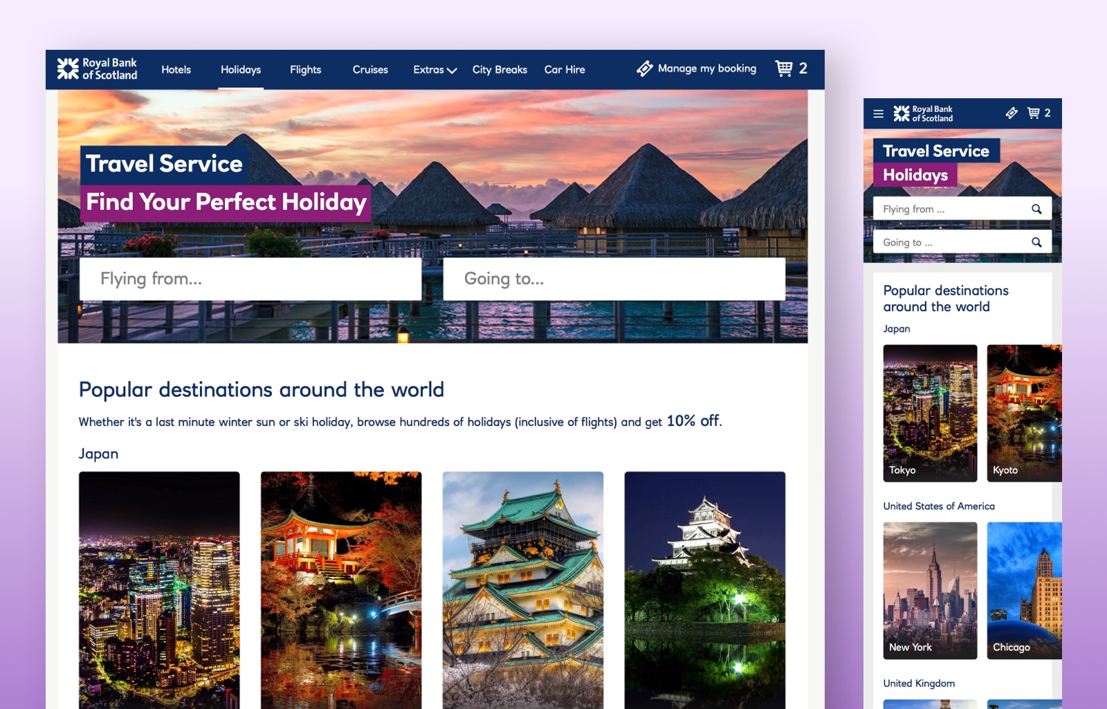
Improve the UX & UI for RBS/Natwest premium members.
The project:
Improve the UX and UI of the web and mobile applications used by RBS/Natwest premium account holders.
Goal:
Reduce the time it takes to complete the purchase.
Allow multiple purchases, i.e., users can book a holiday, hotel, and car in a single session.
Our role:
We were the lead UX/service designers for this project. Working directly with the stakeholders and a team of nine members in the digital team, including front end developers, business analysts, and fellow UX designers.
What we did:
We identified the UX issues in the current system, fixed them, and created new features to achieve user and business goals.
Results:
We were able to deliver a high fidelity prototype that included every key interaction. This was tested by users and proven to be 60% faster than their current system.
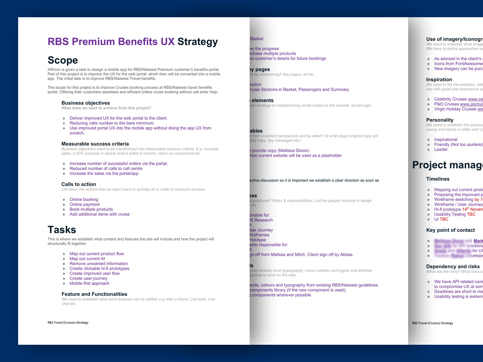
Strategy, planning and information gathering
As with any of our projects, this started with UX strategy documentation.
We gathered every vital piece of information related to the project. Shortlisted business goals, constraints, and ensured that we understood the context. We also listed the name of all relevant people involved from project managers, product owners and developers, to clarify any possible future issues.
We circulated this document to everyone involved in the project, giving them visibility and keeping them in the loop.
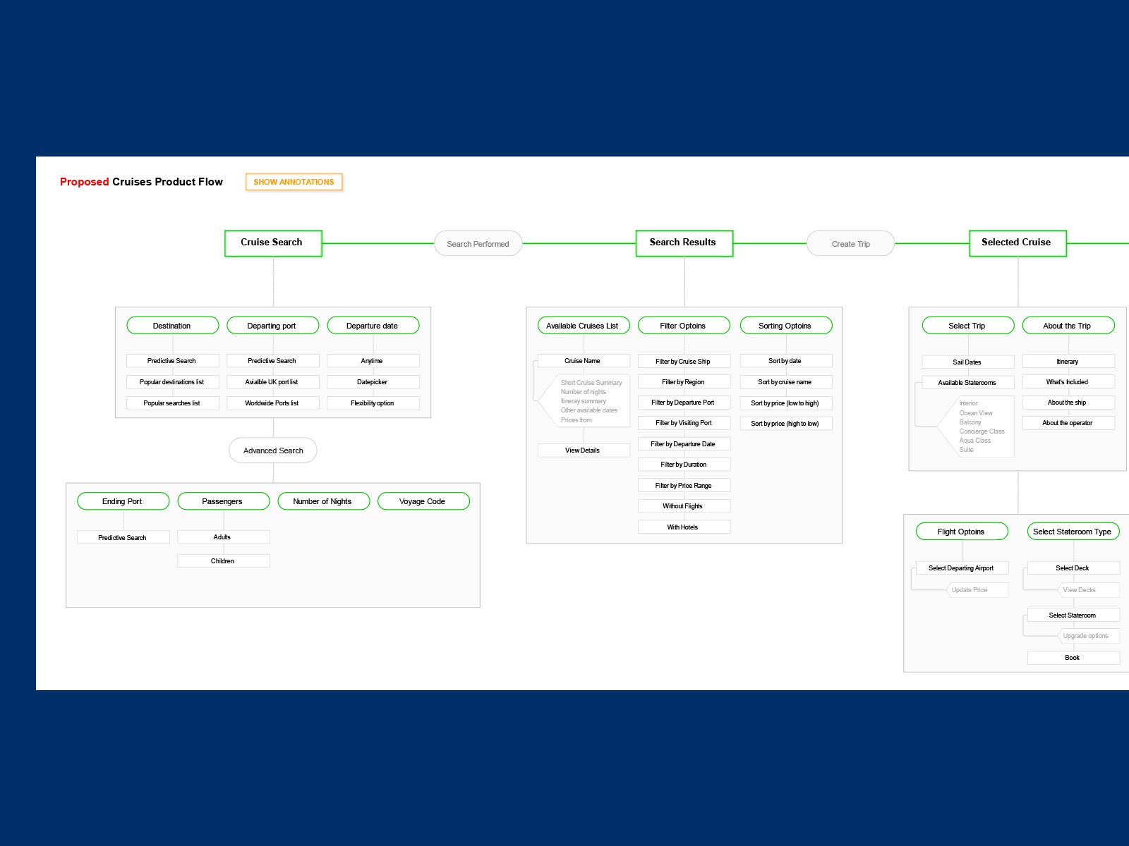
Product flow – sitemap
For any UX project, it’s essential to understand the existing product if there is one, and the best way is to map out the current product flow. Only after that, we were able to propose an improved flow.
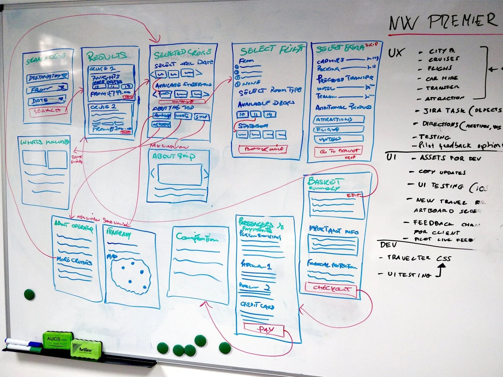
Identifying touchpoints
After mapping out the existing flow, We were able to design a quick user journey using rough wireframes defining the critical touchpoints. That helped us understand the business goals and how those goals could be achieved without disrupting the user’s journey.
This kind of exercise is done with other stakeholders and users using a whiteboard. we kept drawing until the final goal was reached.
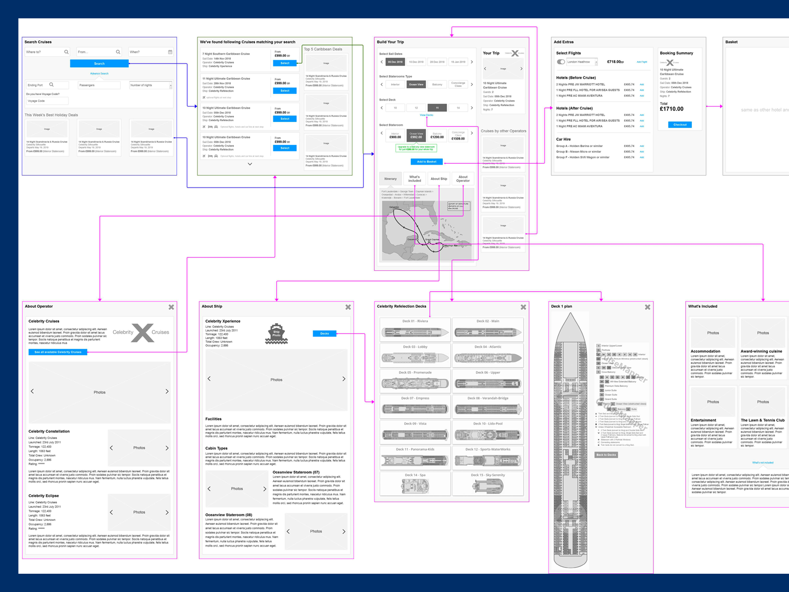
High fidelity wireframes for cruise booking
After identifying the user’s touchpoint, we were ready to design the high fidelity wireframe. Since there were quite a few sections in the application, e.g., flights, hotels, and holidays, we picked the most complicated part, the cruises.
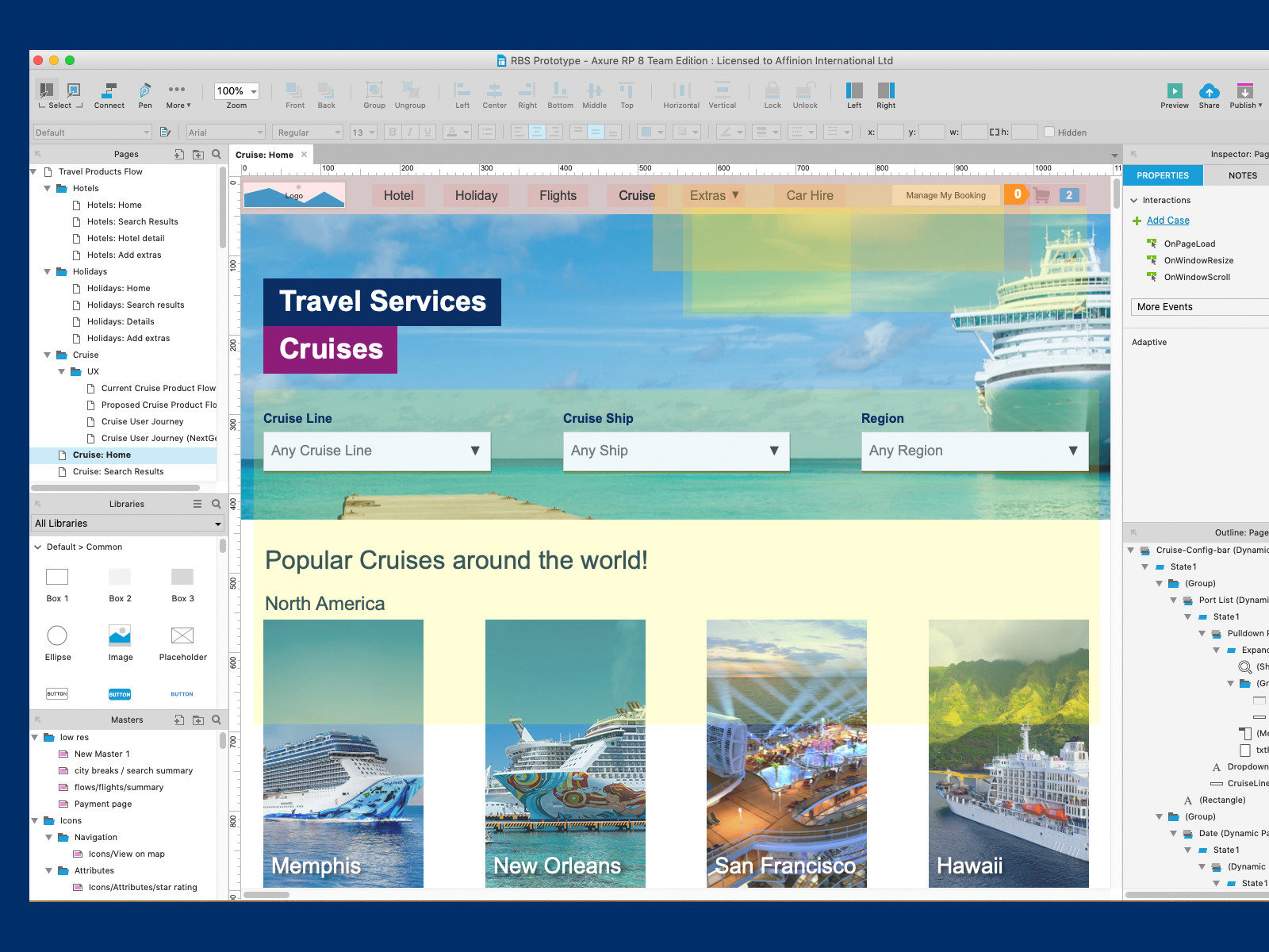
High fidelity prototype
After completing the high fidelity wireframe and connecting the dots, it was time to prototype the concept. We prefer a high fidelity prototype as it’s always best to test with the users. We used Axure for high fidelity prototyping.
Info
Retail and Banking, UX
June 22, 2017
